Seasonalysis v3.0
I’ve been working on and off on Seasonalysis 3.0 for the past 4-5 months. Seasonalysis was my very first app on the App Store. There was a lot of legacy code and poor architectural descisions so I decided to rewrite the app from the ground up for iOS 7.
I’ve been using iOS 7 since WWDC and very much appreciate the new design aesthetic. I was hoping to have the update ready for iOS 7’s release but due to other commitments that won’t happen. Expect to see it early October. Some of the back end improvements that may be of interest to my developer brethren:
- Migrated from SQLite to Core Data. No regrets.
- Pattern generation and updates are encapsulated in respective NSOperation sub-classes. I was also able to improve pattern generation algorithms by a factor or 3.
- Nearly 60% reduction in lines of code even with a greatly expanded feature set. Hurrah for modern API’s and great abstraction layers!
- Leveraged Shinobi Charts framework for all charts. Highly recommended.
- Abstracted access to Yahoo Finance into a wonderful library built on top of AFNetworking. I plan on open sourcing this sometime after v3 release.
Read on for before and after screenshots with additional commentary.
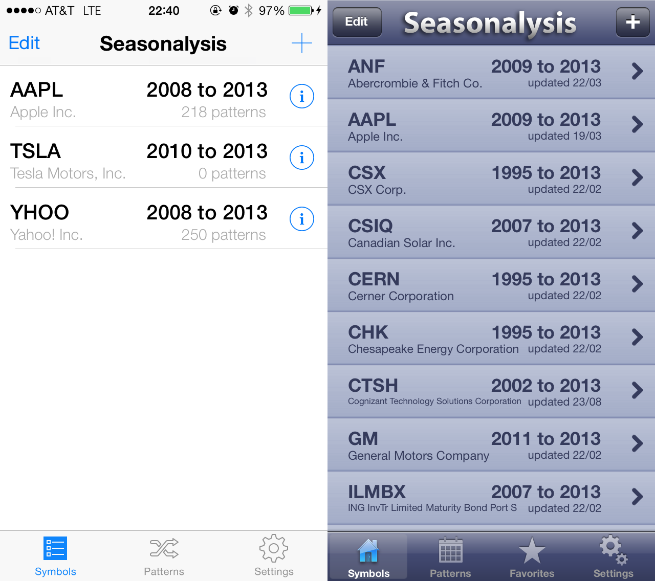
Not much to say here. Content is front and center. I was also able to merge Patterns and Favorites, making for simpler navigation.
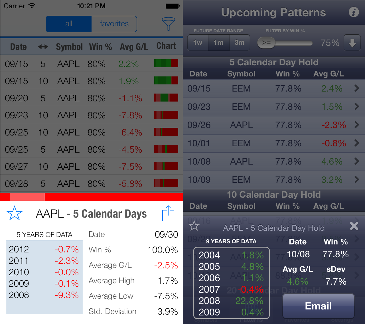
The new pattern detail screen is about 20% taller than the old one. I was able to squeeze in additional pattern information and added a pattern sharing option. Even with the additional data I think v3 spacing feels markedly better.
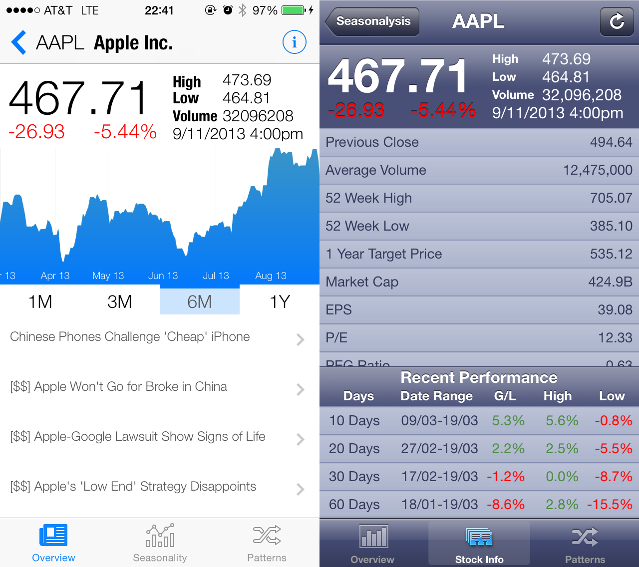
Seasonalysis v3.0 adds a news feed and interface stock price chart. The symbol fundamentals are now accessible by tapping the information button.
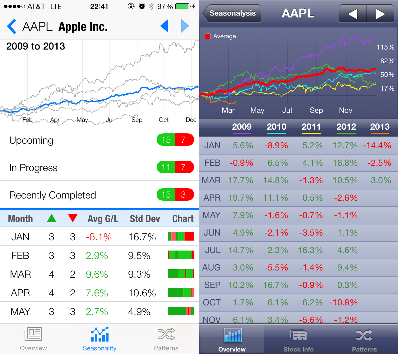
There are a couple big changes in the Seasonality tab. First up is the new upcoming, in progress, and recently completed patterns options that allow you to jump right to the relevant patterns.
Next up is monthly seasonality statistics. Version 2 had an information dump for each month front and center. This has now been hidden behind an action sheet along with additional monthly statistics.
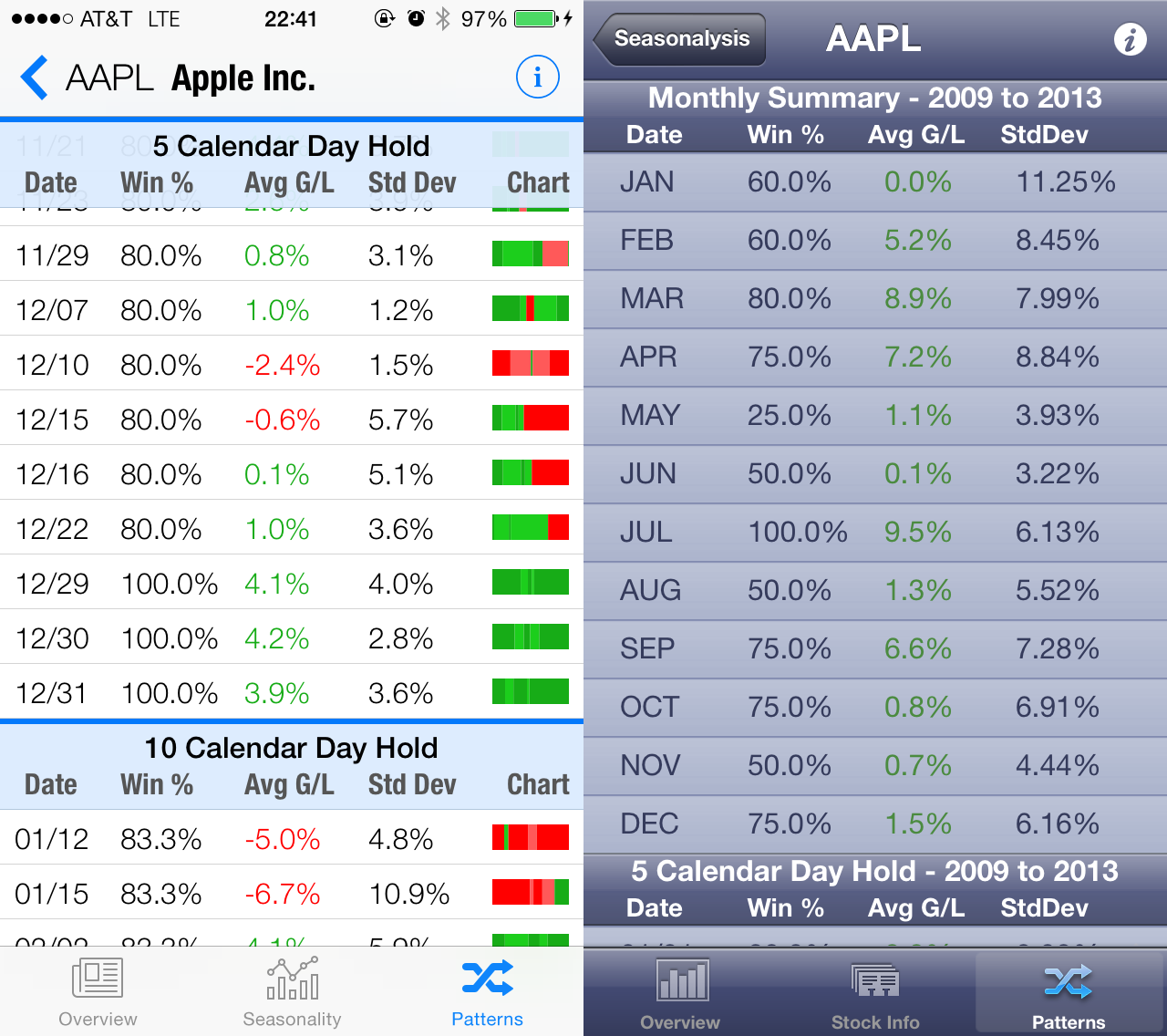
The biggest change here is the addition of the spark chart. The chart represents the 5 most recent years of pattern data. The colors represent an absolute gain or loss and the width of each segment represents the magnitude of the move. This is incredibly useful in providing a quick look on how a pattern has behaved recently.
I can’t wait to get this update on current and new customer devices. Most importantly, I’ve laid a solid foundation for future releases with a pricing strategy that is sustainable. Stay tuned…
P.S. If you’re interested in participating in the beta please shoot me an email!.